
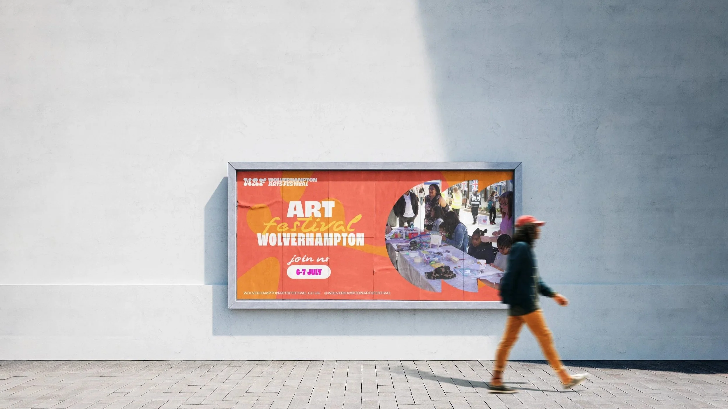
Wolverhampton Arts Festival
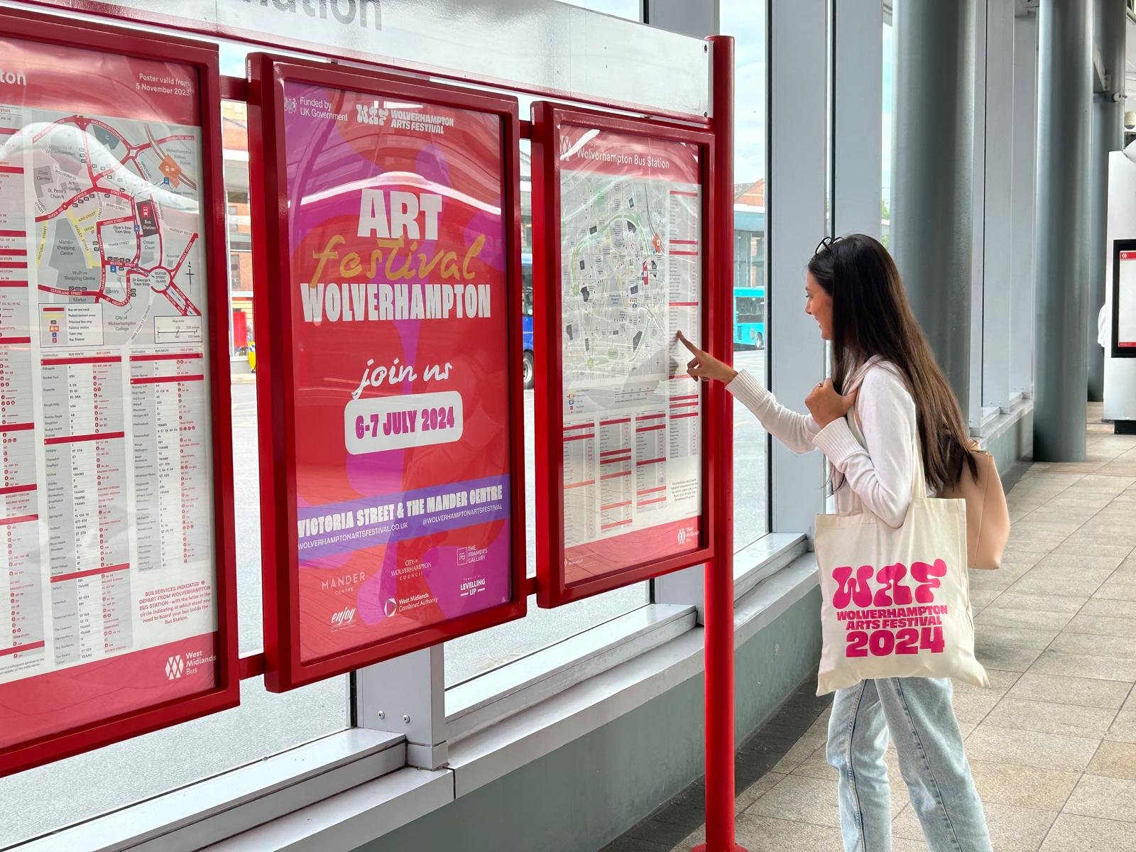
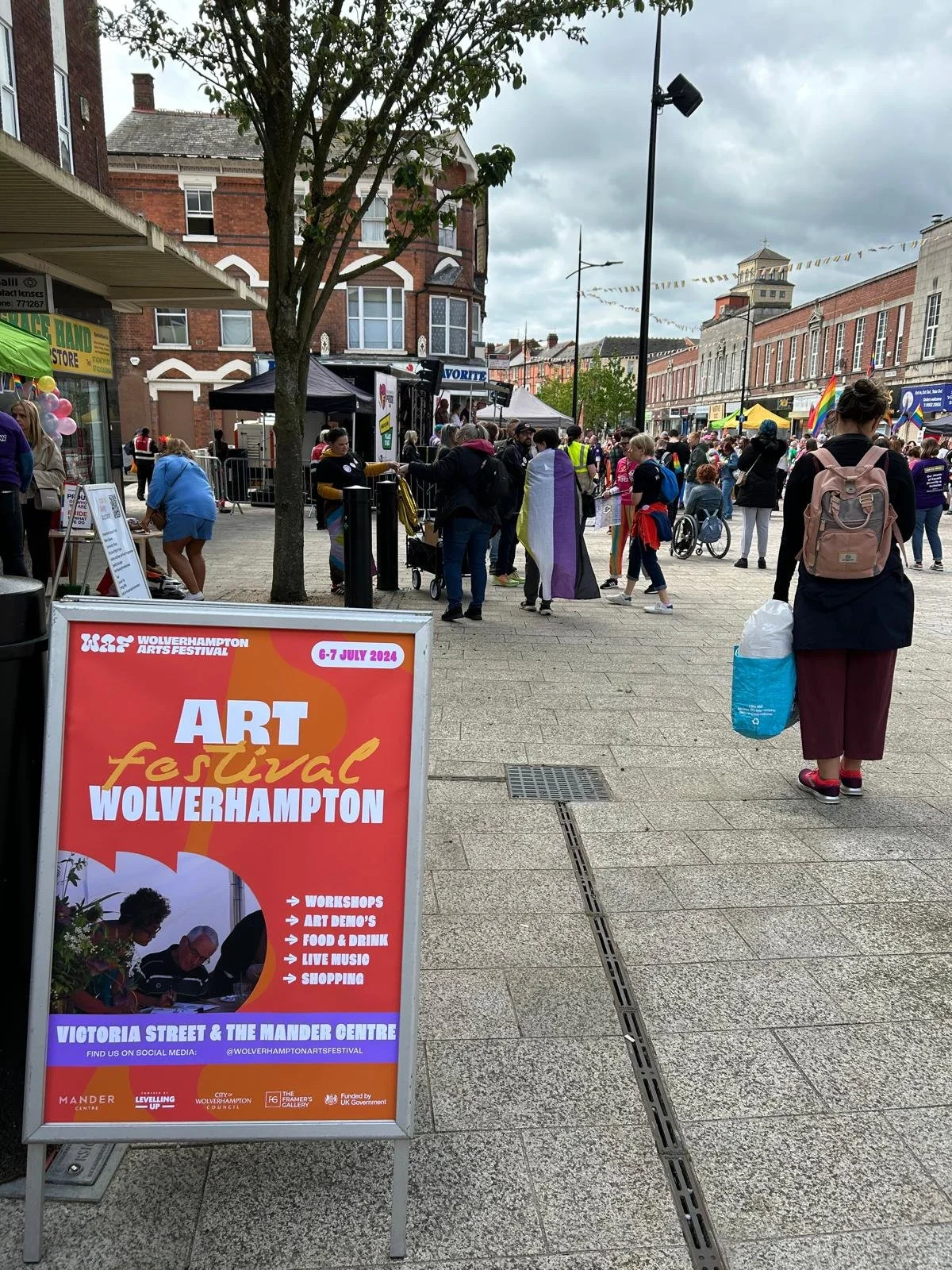
Wolverhampton Arts Festival brings the city's creative community together for a weekend of workshops, live performances, artist demonstrations and independent makers. To support an event of this scale, the visual identity needed to be vibrant, engaging and versatile enough to work across everything from social media and print to large-scale advertising, and merchandise.
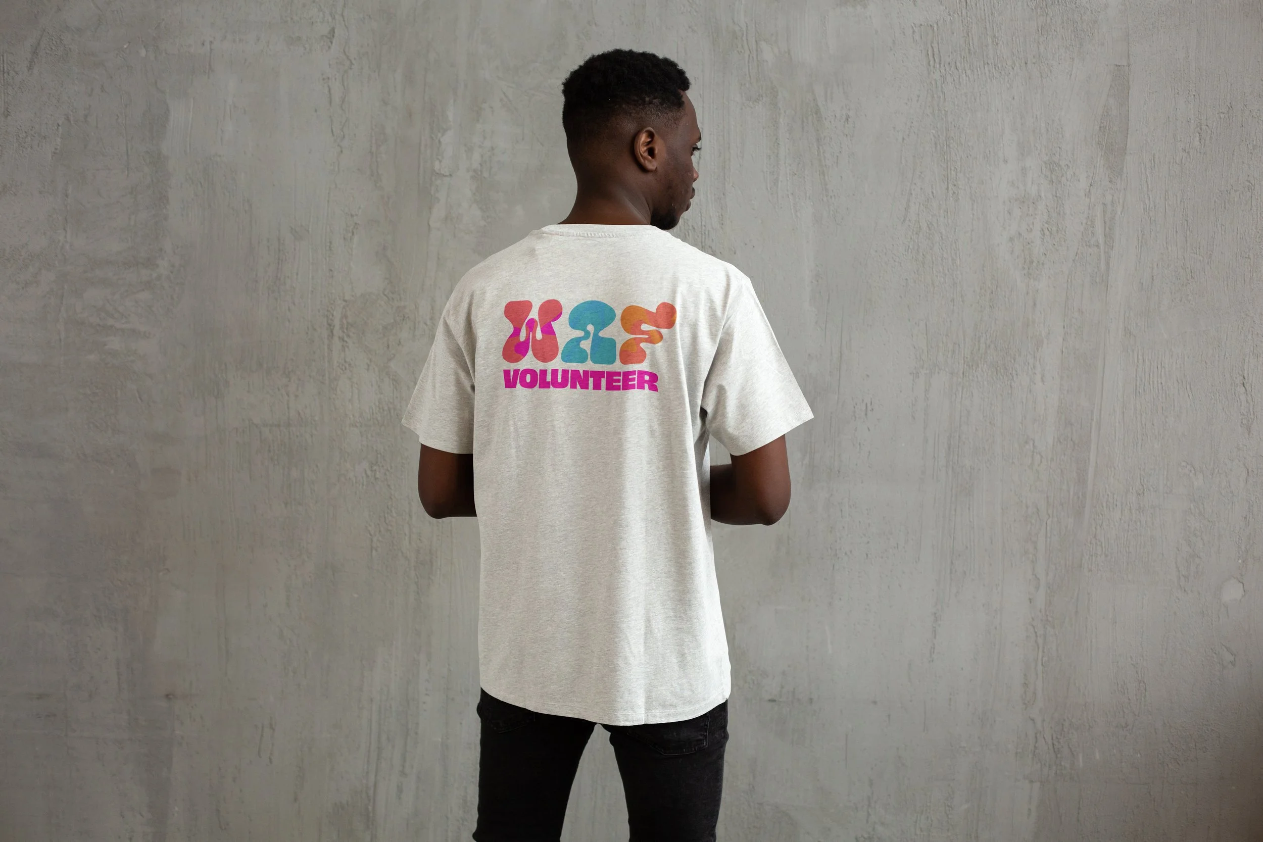
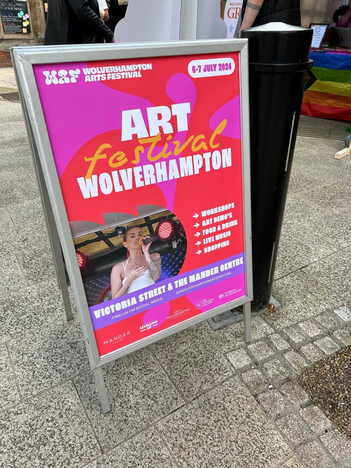
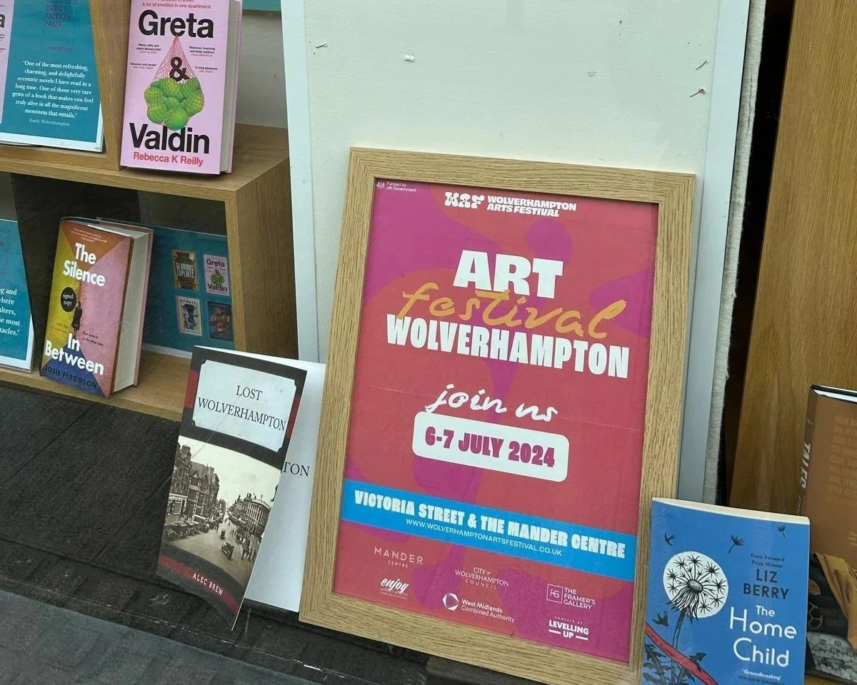
The identity was designed to feel like the festival itself: creative, fun and full of community spirit. Flowing graphic shapes brought a sense of movement, while a vibrant colour palette and bold typography created a playful visual language that celebrated creativity in all its forms—from art and music to performance, craft, illustration and hands-on workshops. Every element was designed to feel welcoming and accessible to people of all ages.
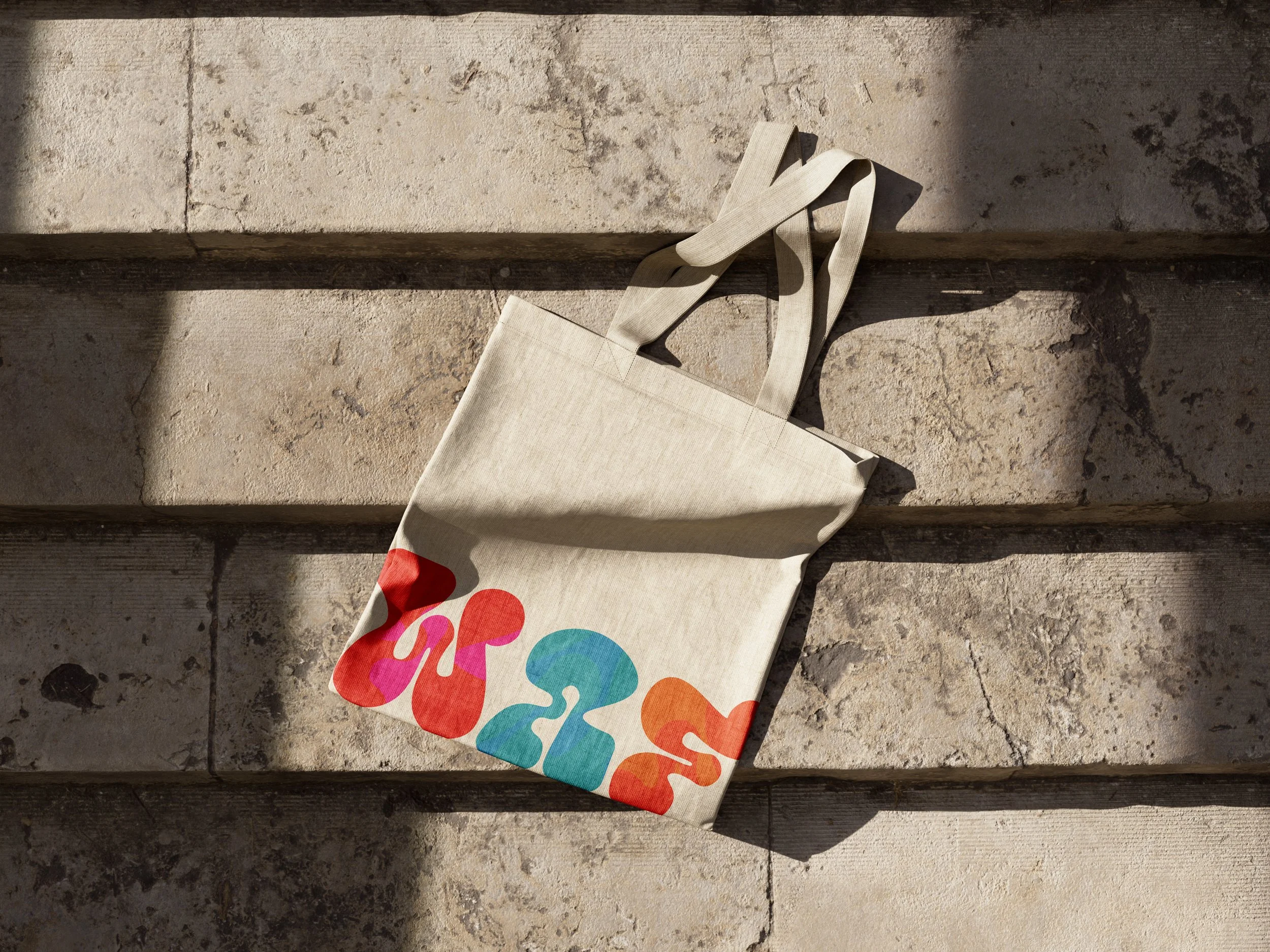
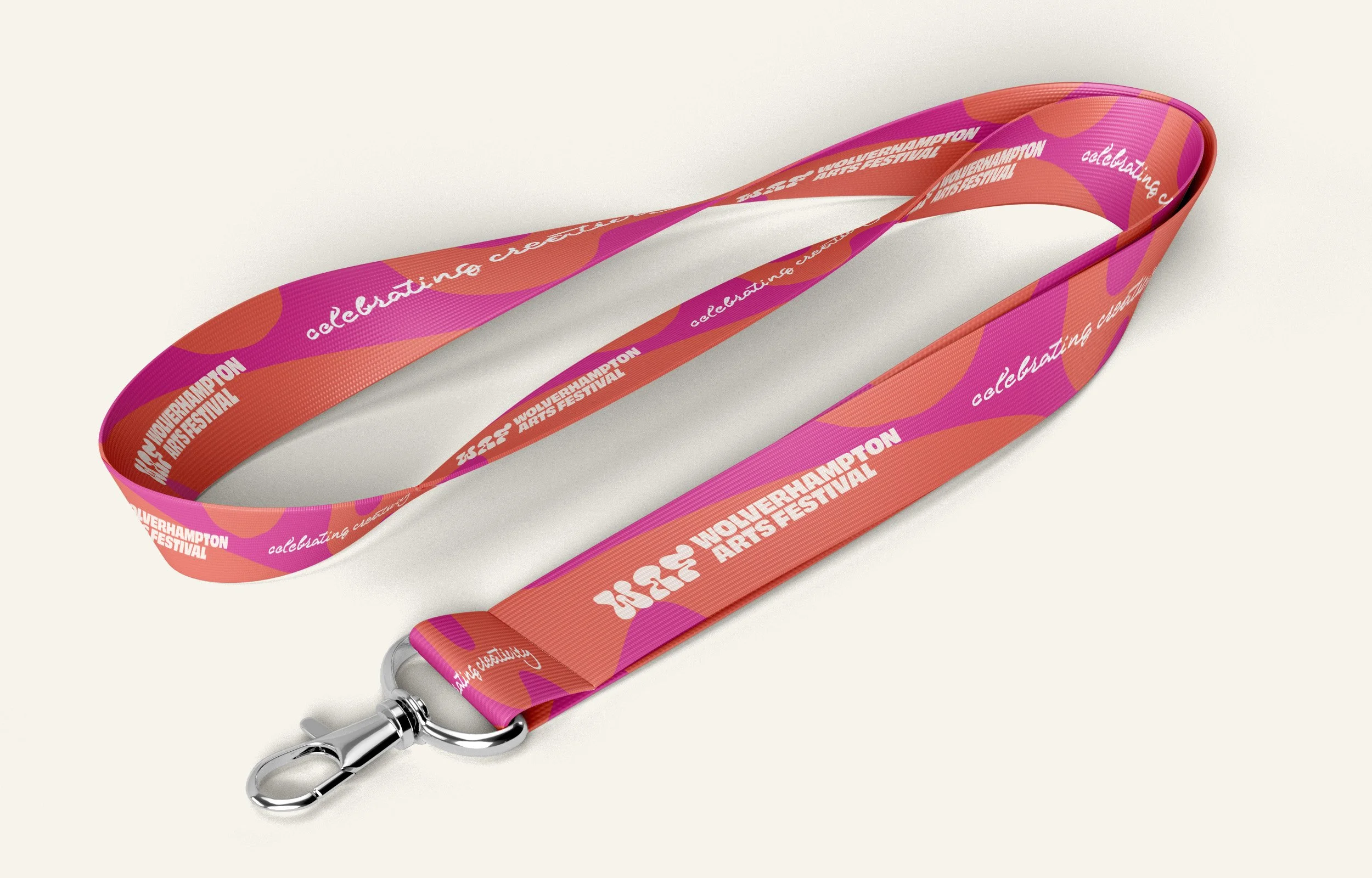
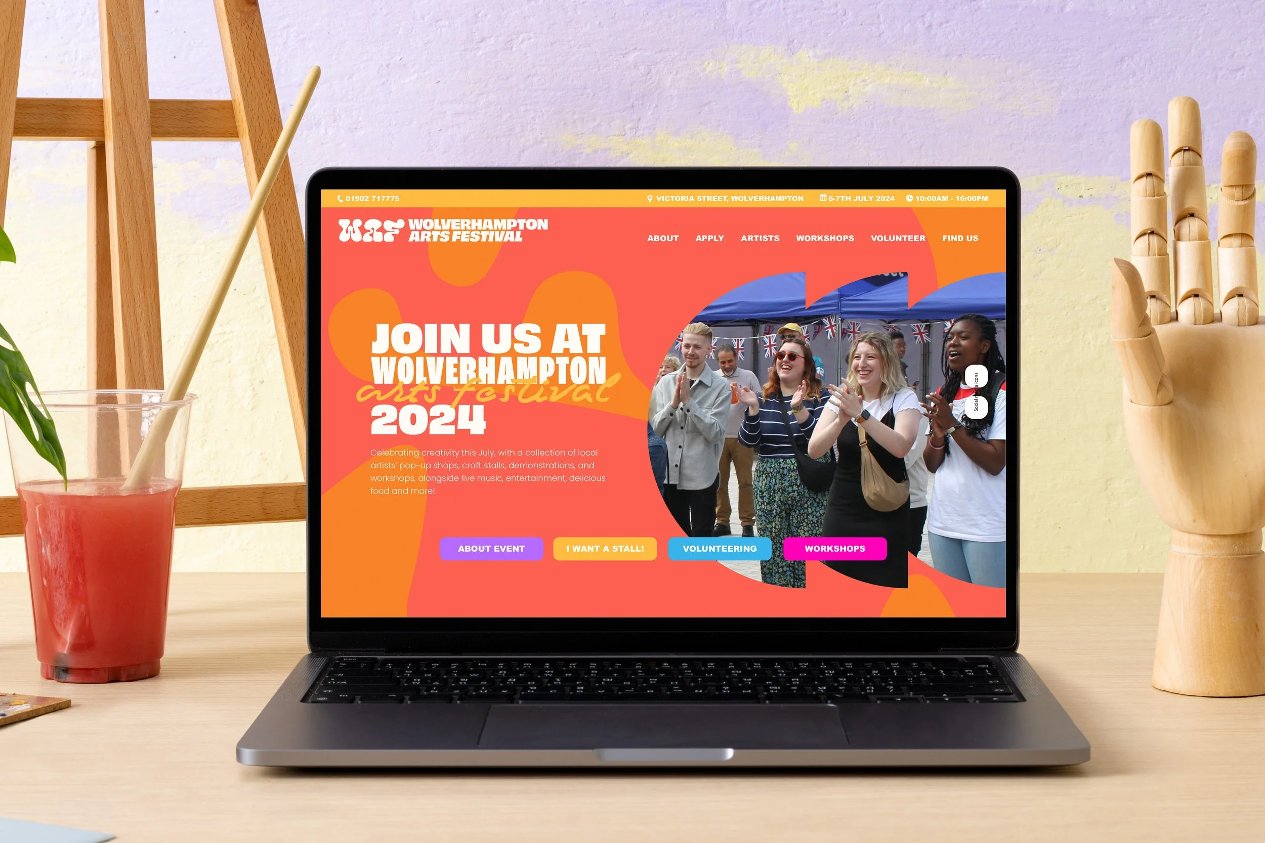
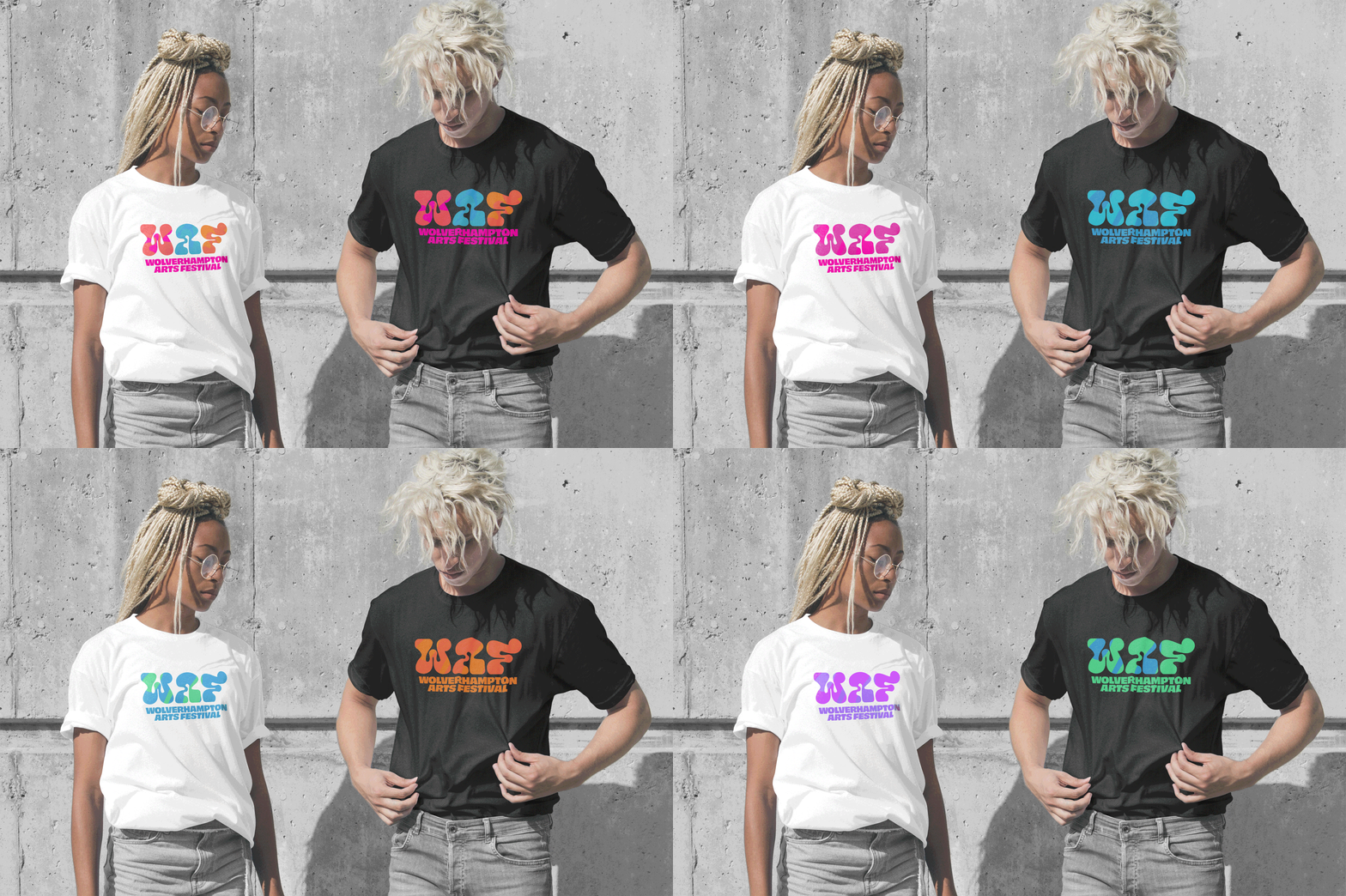
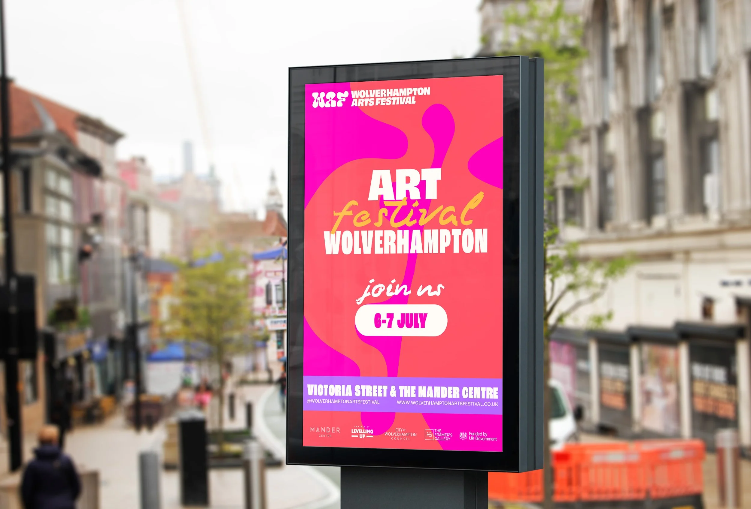
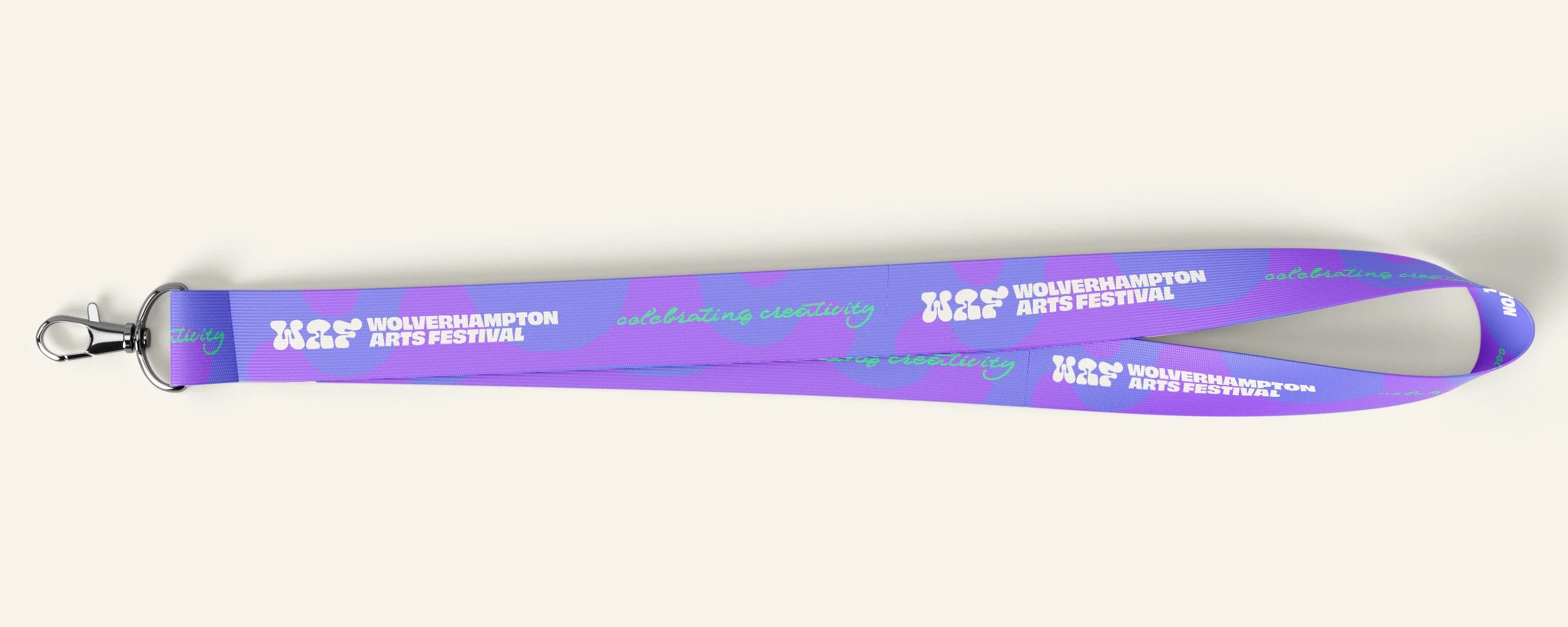
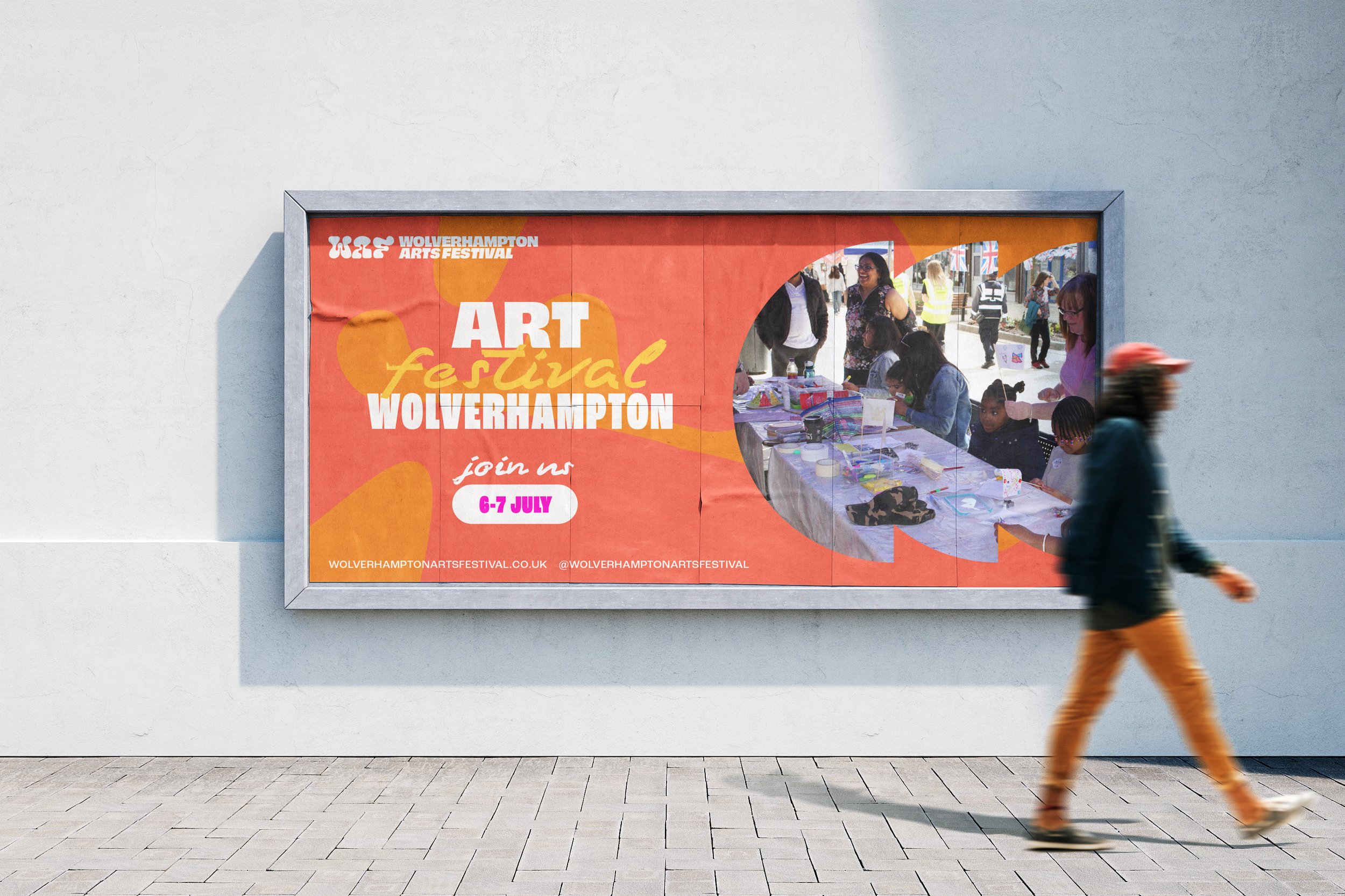
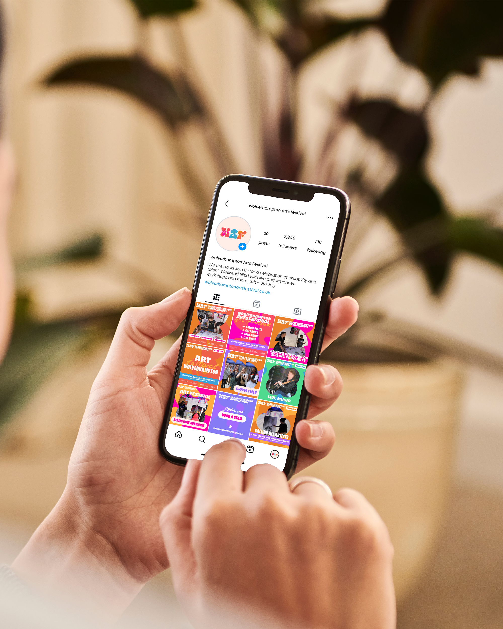
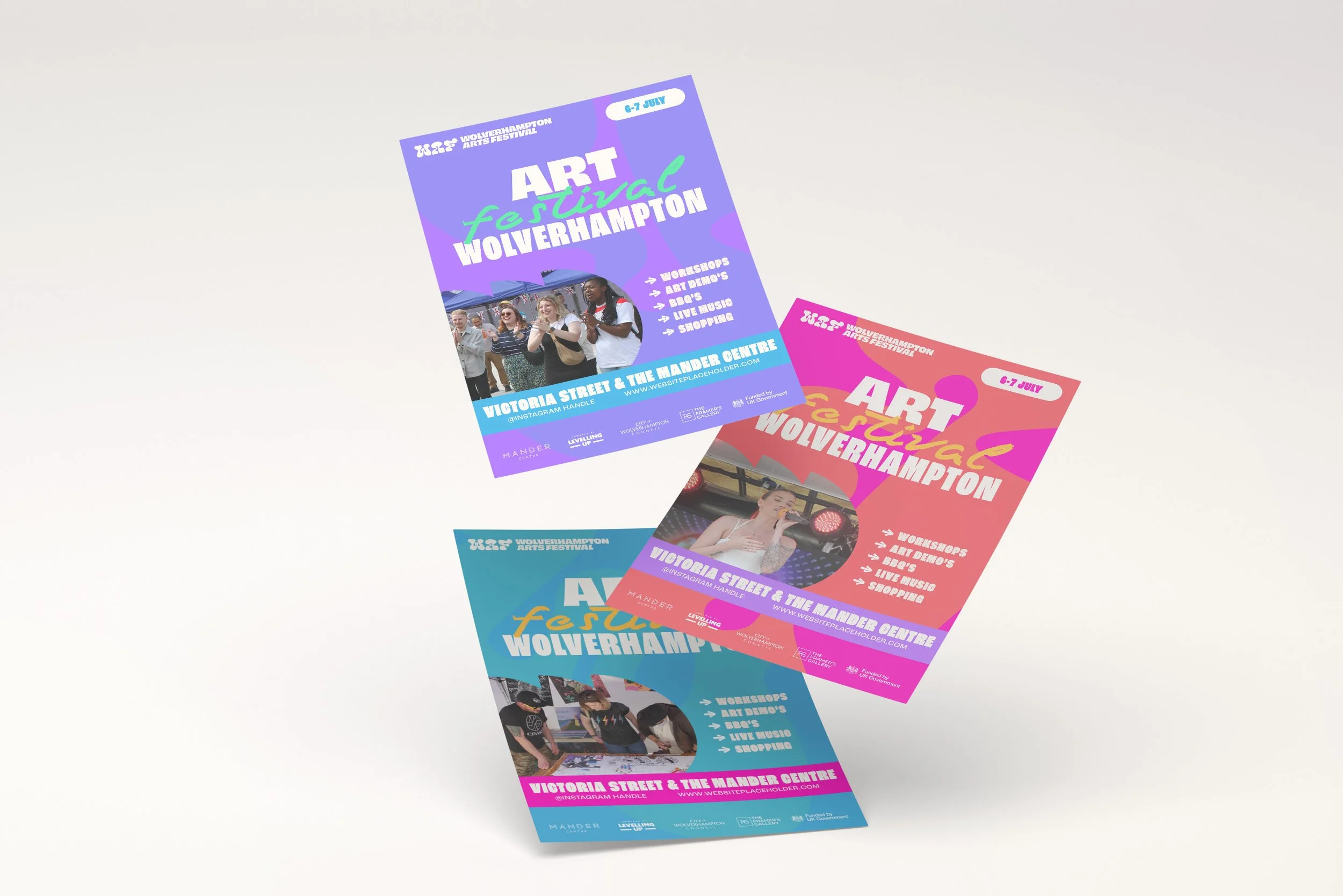
But creating a vibrant identity was only half the challenge. Designed to return year after year, the visual system also needed to work hard behind the scenes. It had to be practical, repeatable and quick to adapt as new events, artists and campaigns were introduced. Every element—from the interchangeable colour palette to the modular graphic shapes—was designed to mix and match effortlessly, allowing new artwork to be created quickly without compromising consistency. The result was a toolkit that could evolve with the festival while remaining unmistakably Wolverhampton Arts Festival.
Brand Application
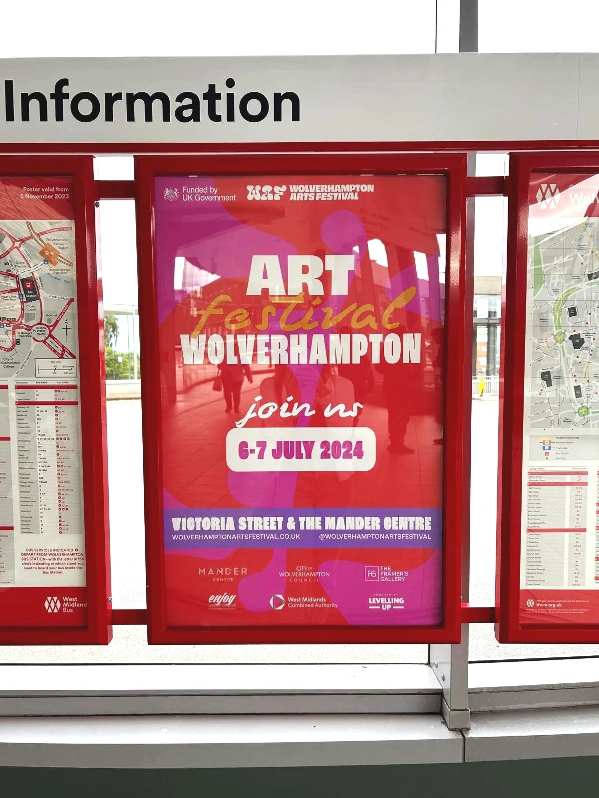
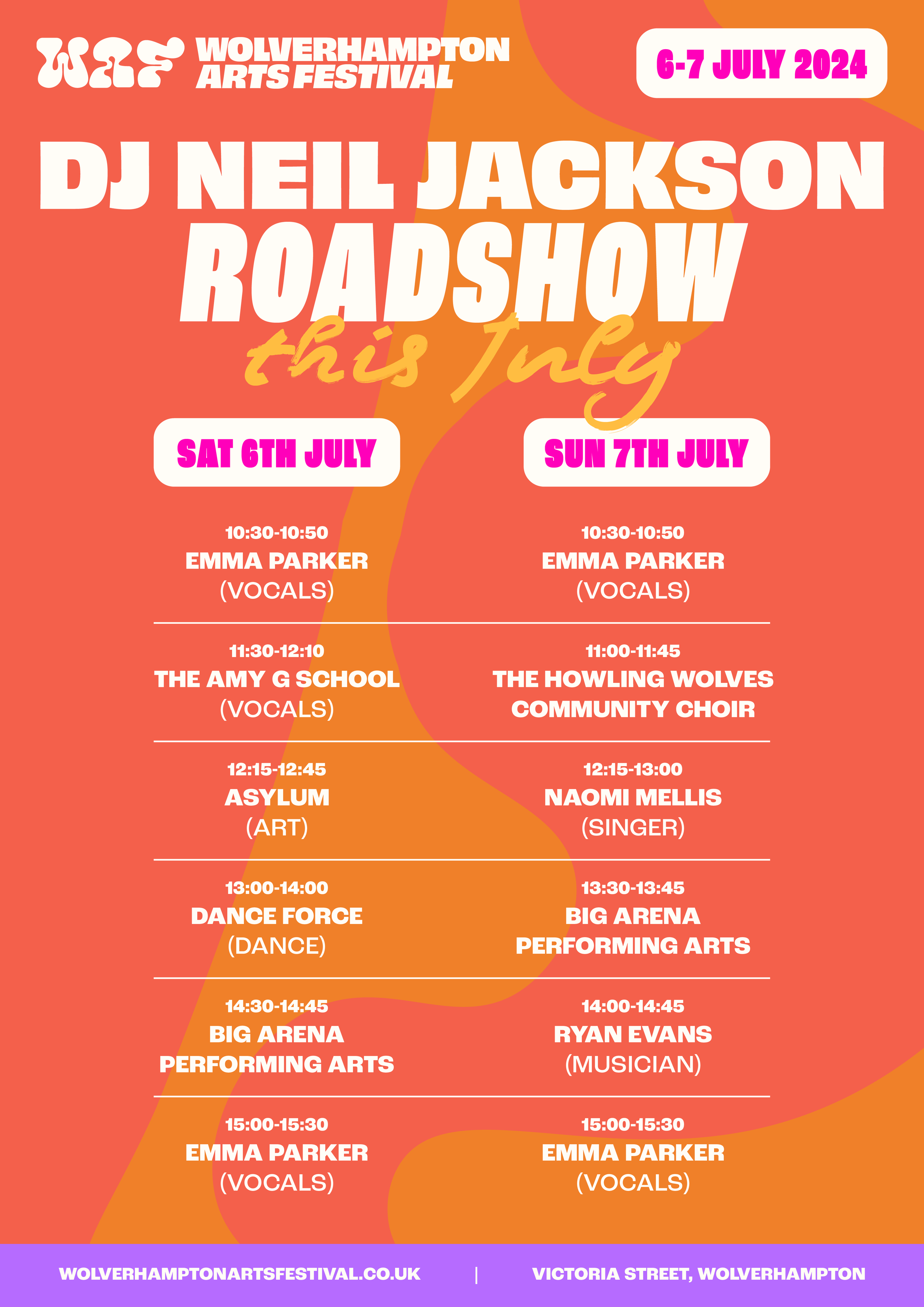
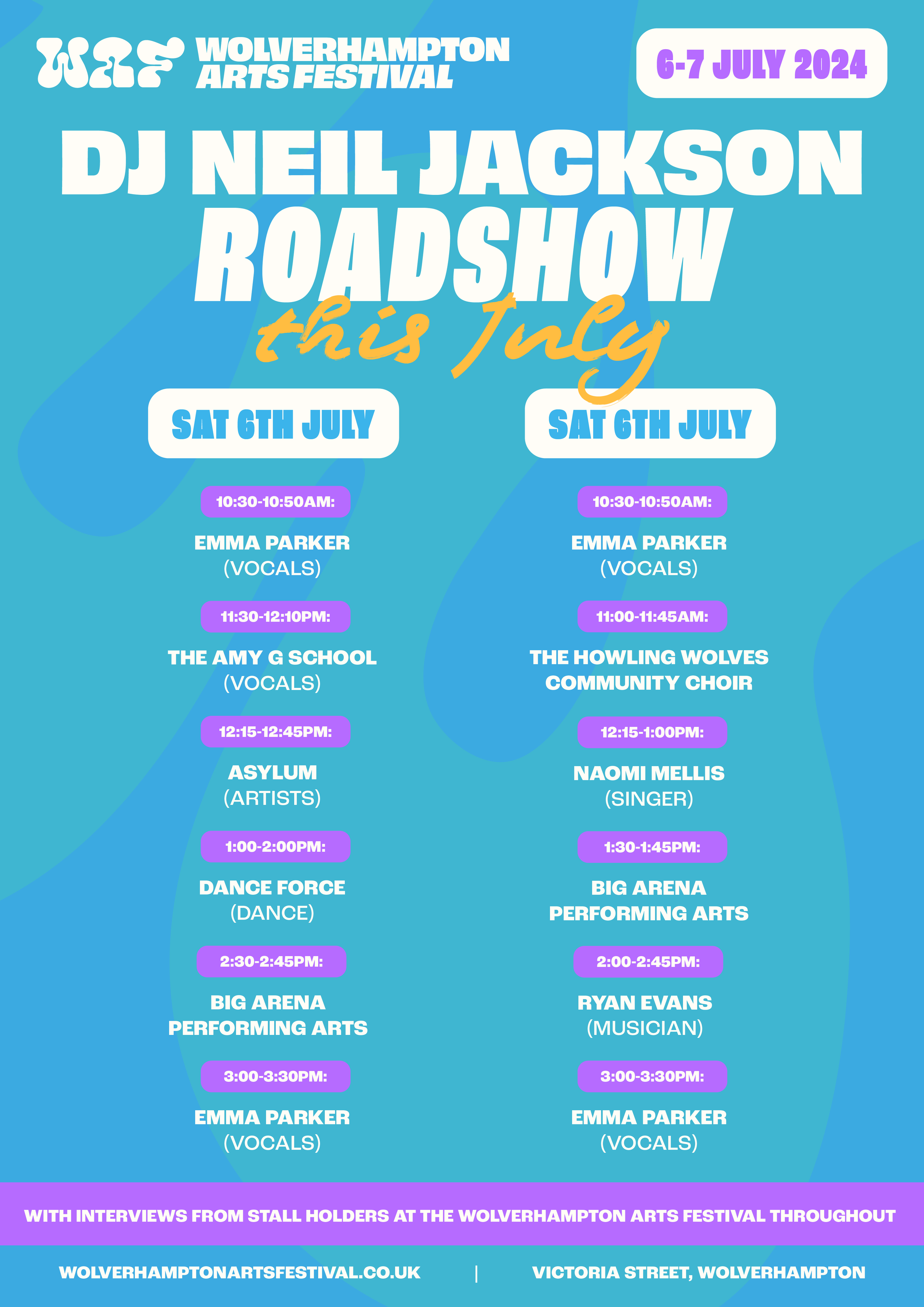
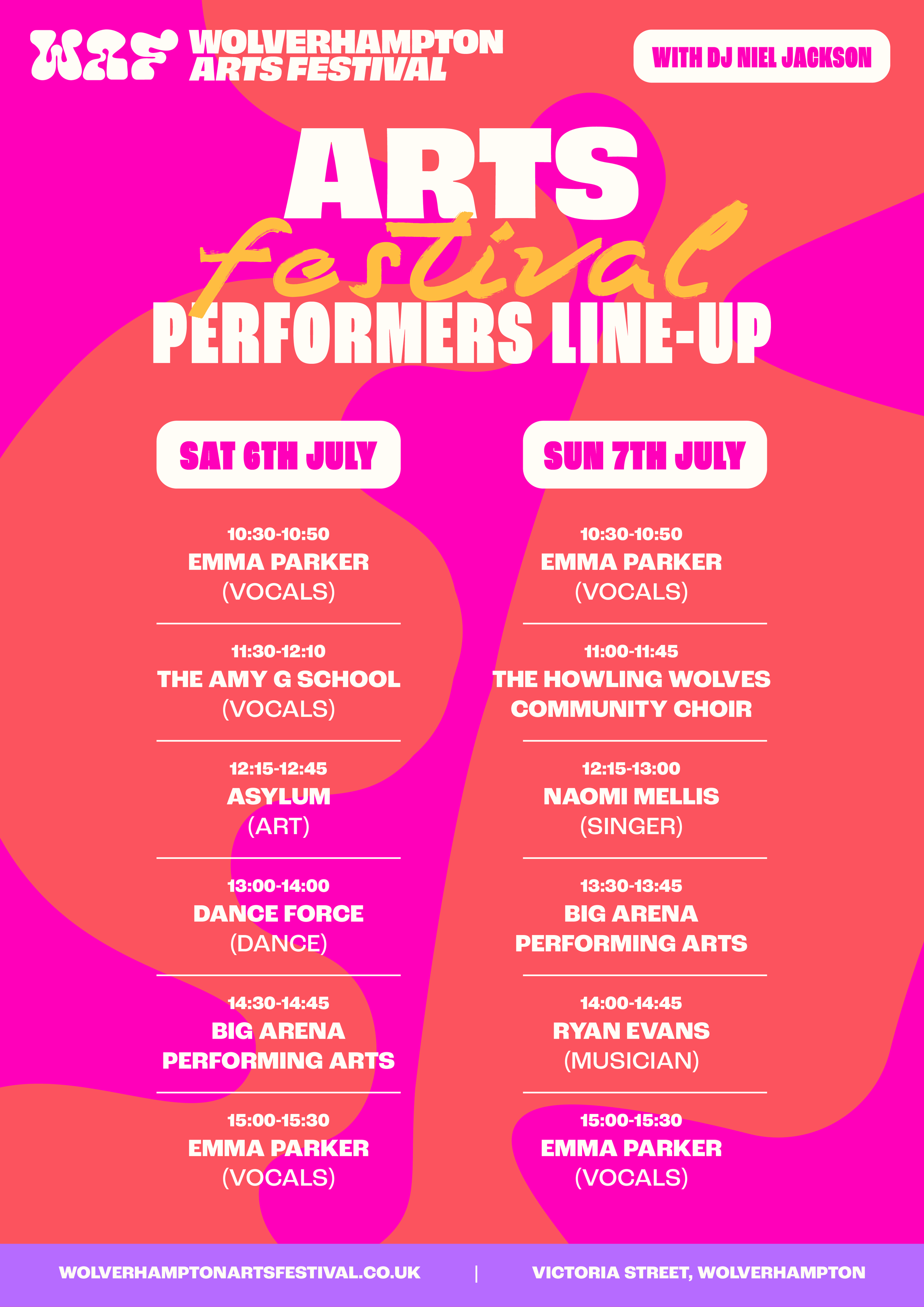
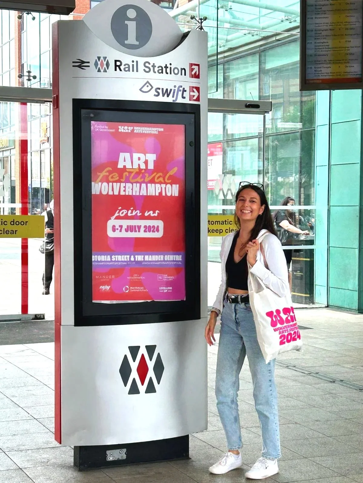
There's always something special about seeing a brand leave the screen and become part of the real world.
I had the pleasure of attending the festival one year and captured a selection of photographs showcasing the identity in use throughout the event. Additional photographs were kindly provided by the festival organisers.
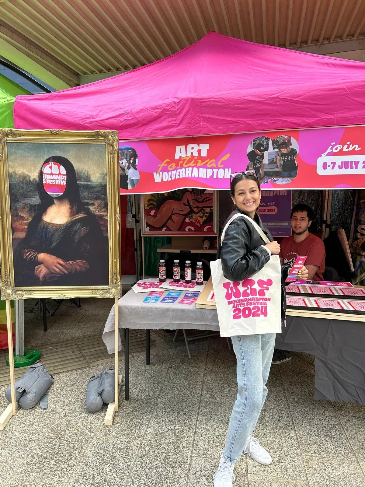
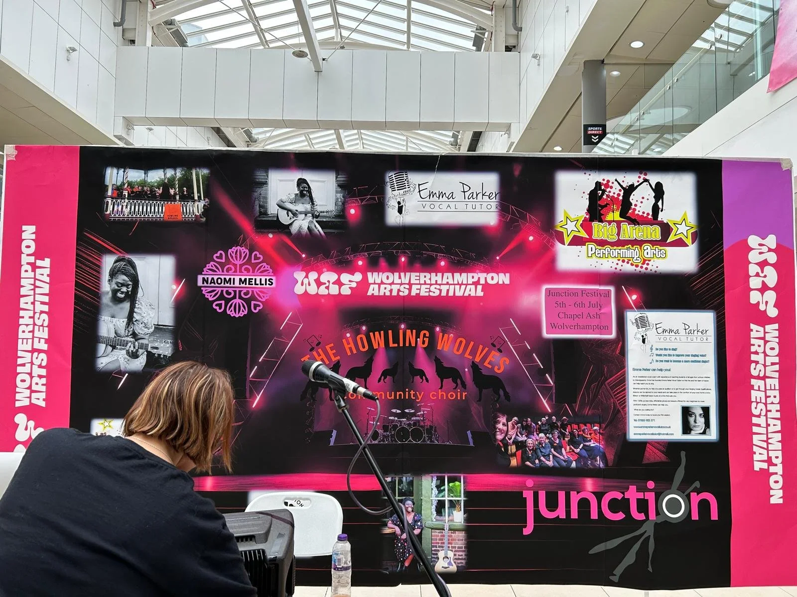
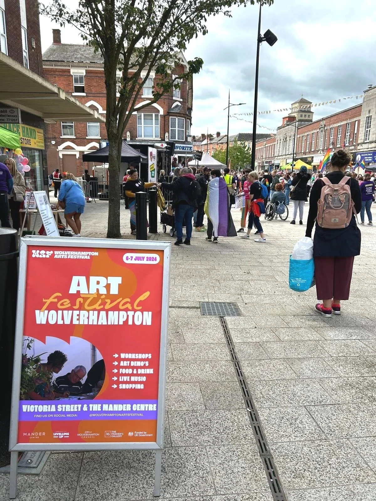
It all starts with an idea.
Great ideas deserve great execution.
Whether you're launching something new or ready for your next chapter, I'd love to help bring your vision to life.