
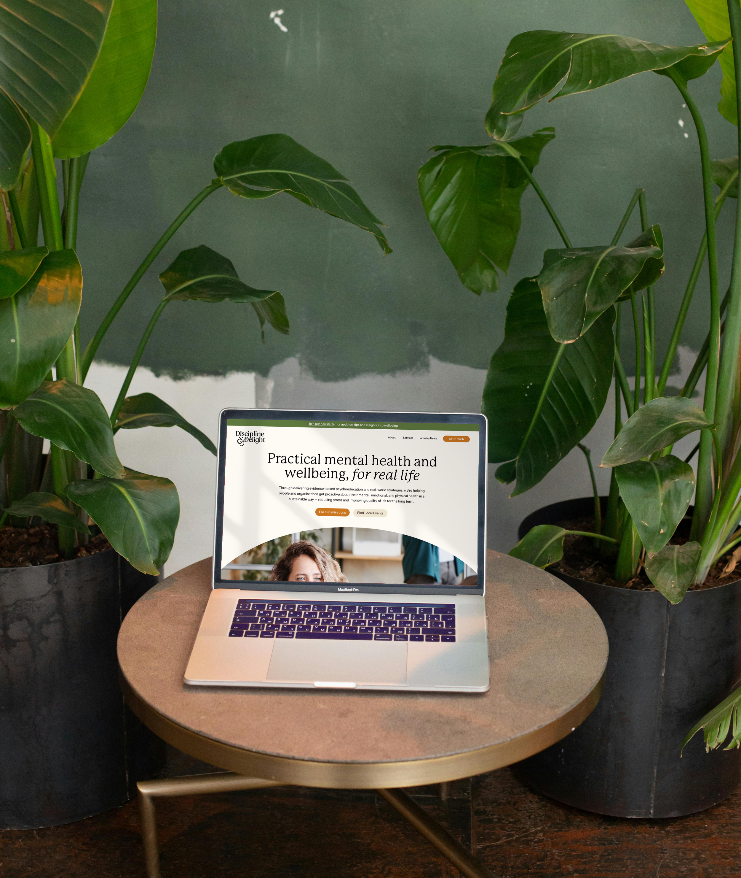
Discipline & Delight
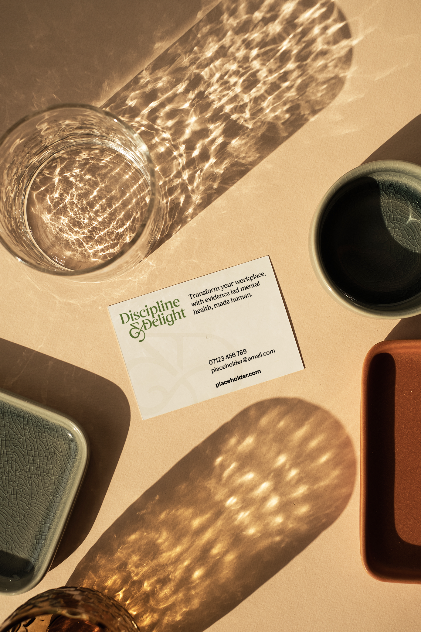
How do you create a credible identity in the mental health space without looking like a traditional mental health service? That was the thinking behind Discipline & Delight, a wellbeing consultancy helping individuals and organisations turn evidence-based psychological knowledge into practical, everyday tools.
The challenge was to develop a visual identity that communicated professionalism, expertise and trust, while clearly distinguishing the brand from clinical, therapeutic and medical services. The result is a warm, optimistic identity that balances credibility with approachability, reflecting Discipline & Delight's focus on education, empowerment and everyday wellbeing.
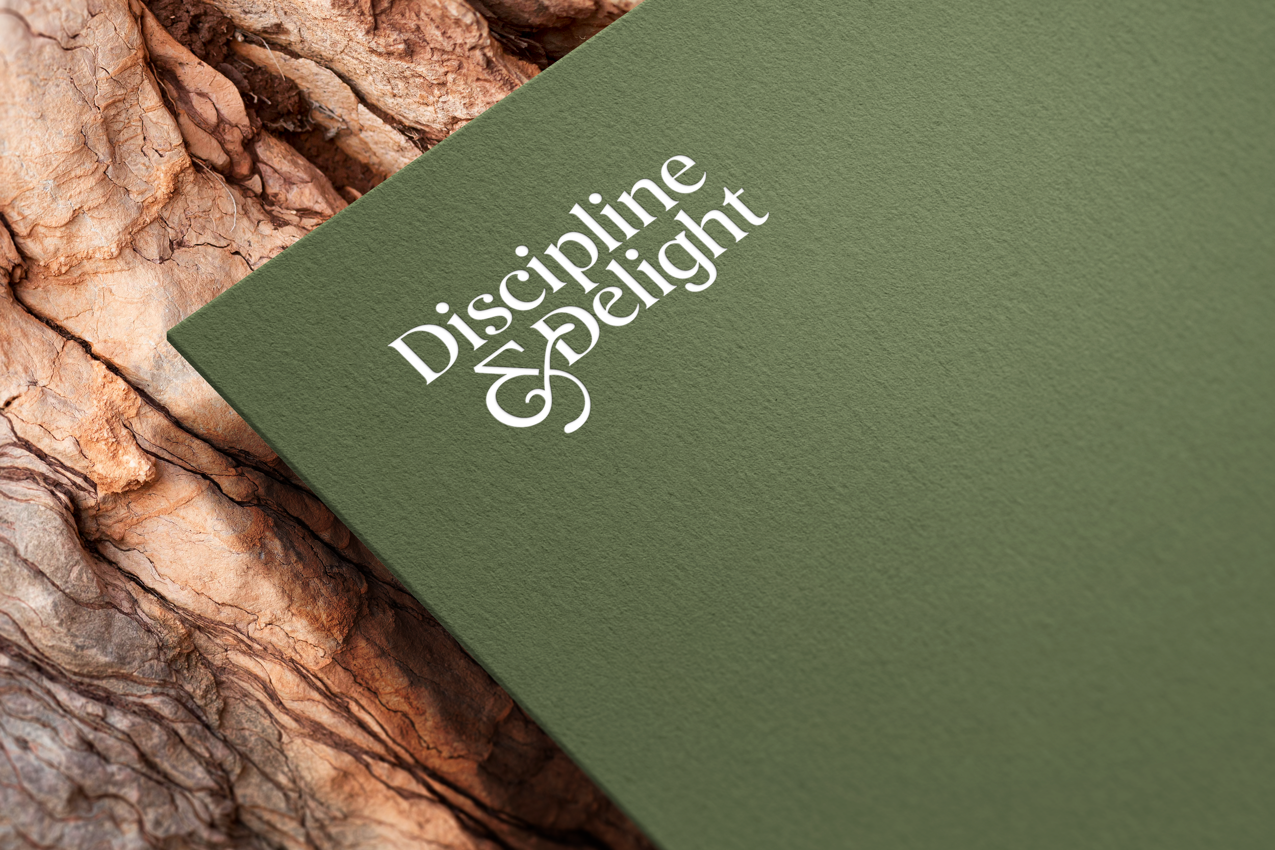
This identity needed to occupy a space of its own. Grounded in psychological expertise, but free from the clinical conventions of traditional mental health services.
Designing The Logo:
Version One
The founder wanted the logo to reflect one of the brand's central themes: growth. A grapevine was a key source of inspiration, symbolising prosperity, resilience and the ability to thrive even in challenging conditions. It was also important that the identity avoided anything overly medical or clinical.
However, during the initial design explorations, it became clear that a literal grapevine symbol risked making the brand feel more like a wine or vineyard business than a wellbeing consultancy.
This led me to explore a more subtle approach: bringing the contrasting meanings of discipline and delight into the typography itself.
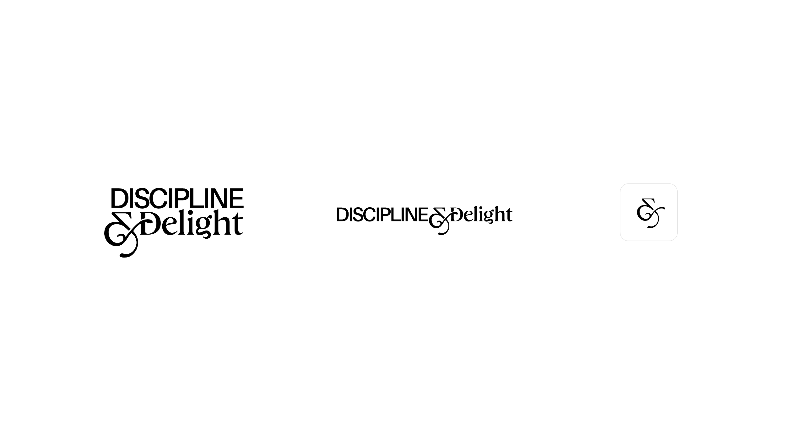
Designing The Logo:
Version Two
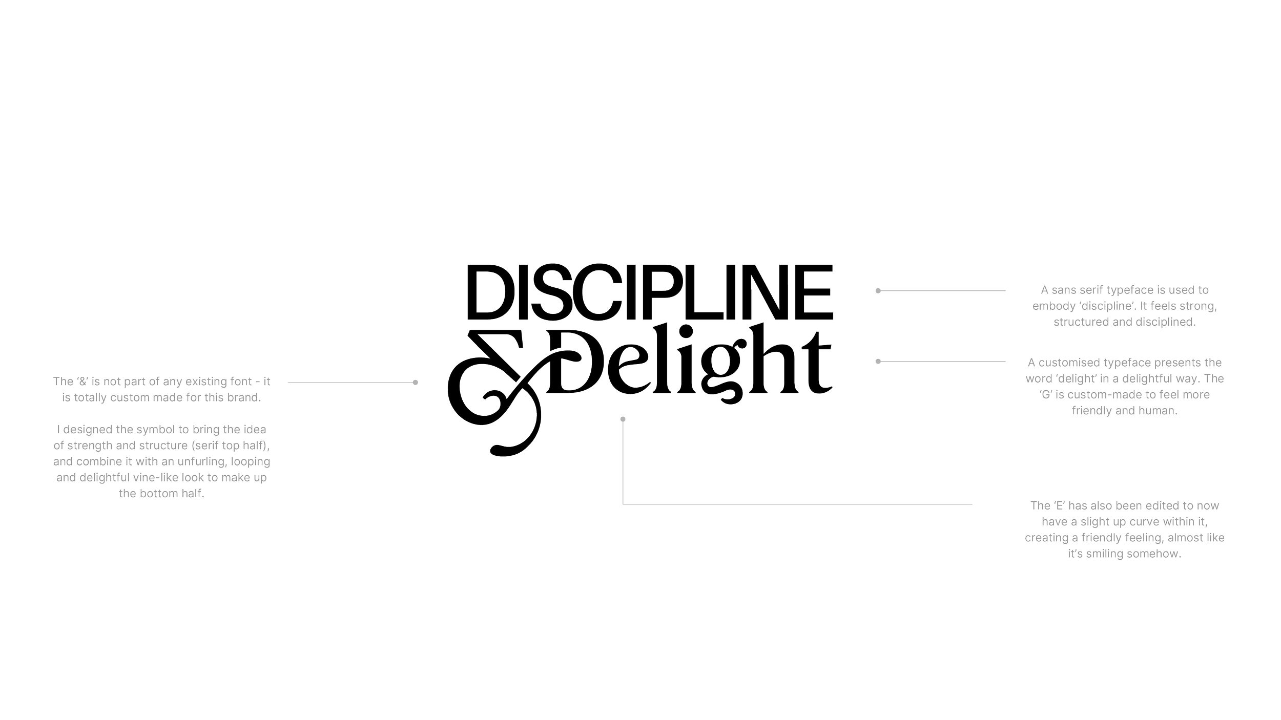
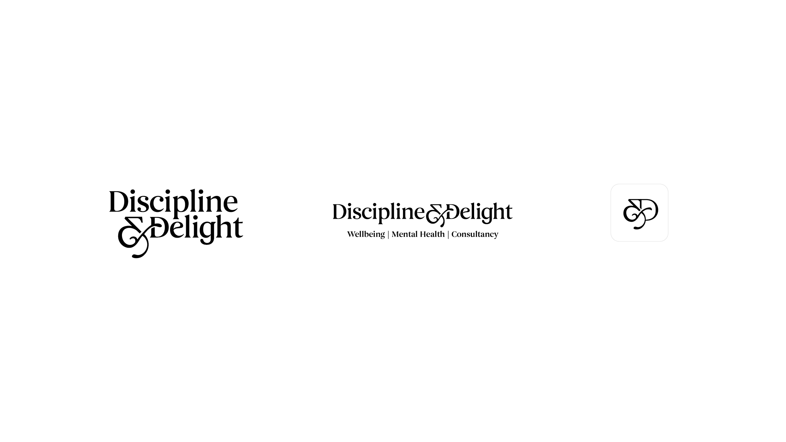
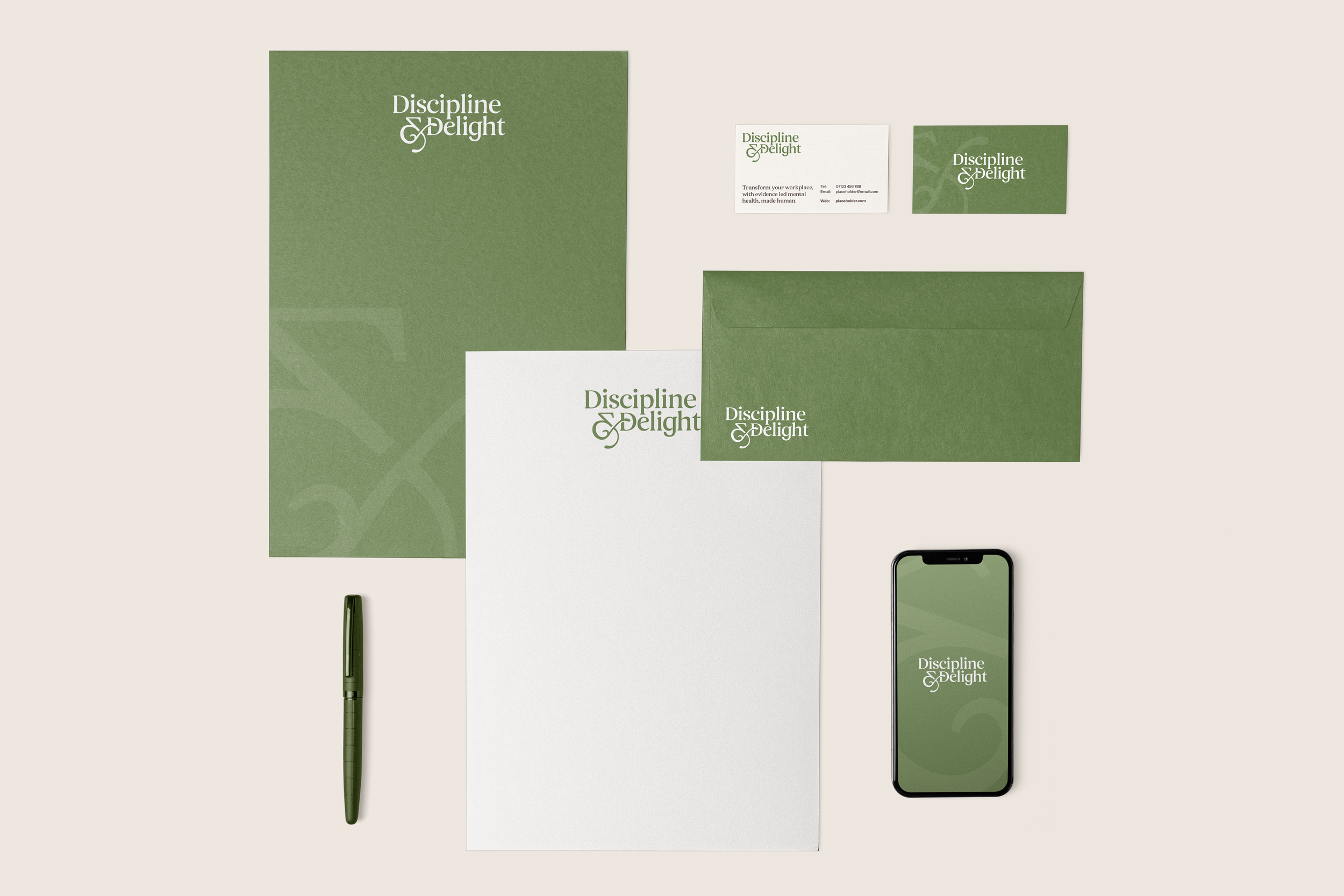
The final logo took a more unified typographic approach, with subtle customisations to balance the contrasting ideas of ‘Discipline’ and ‘Delight’.
A new ‘G’ was developed to retain the friendly, expressive character of the earlier exploration, while sitting more naturally alongside the surrounding letterforms.

Brand Application
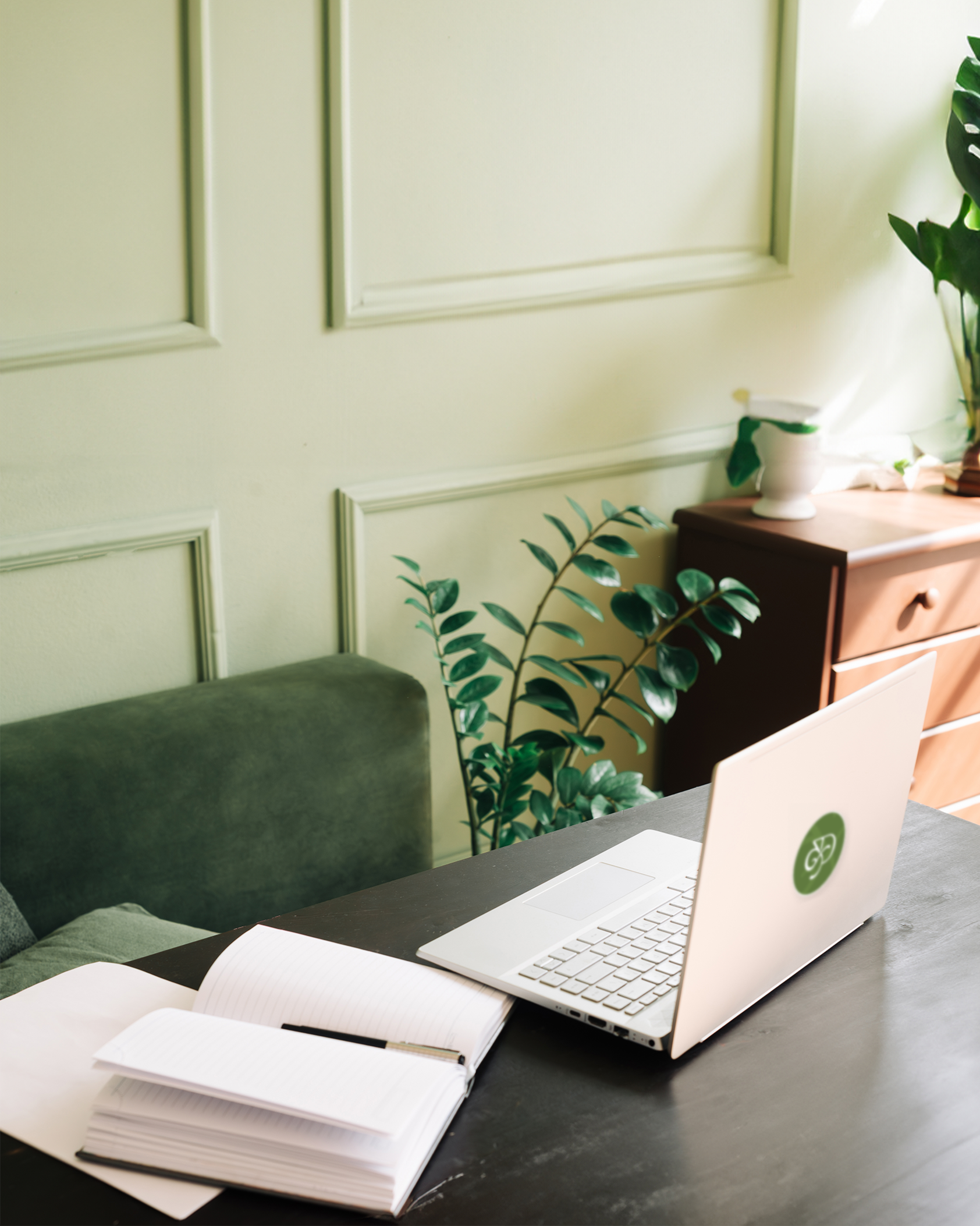
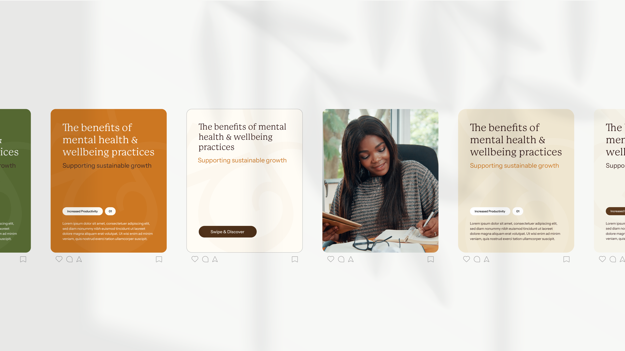
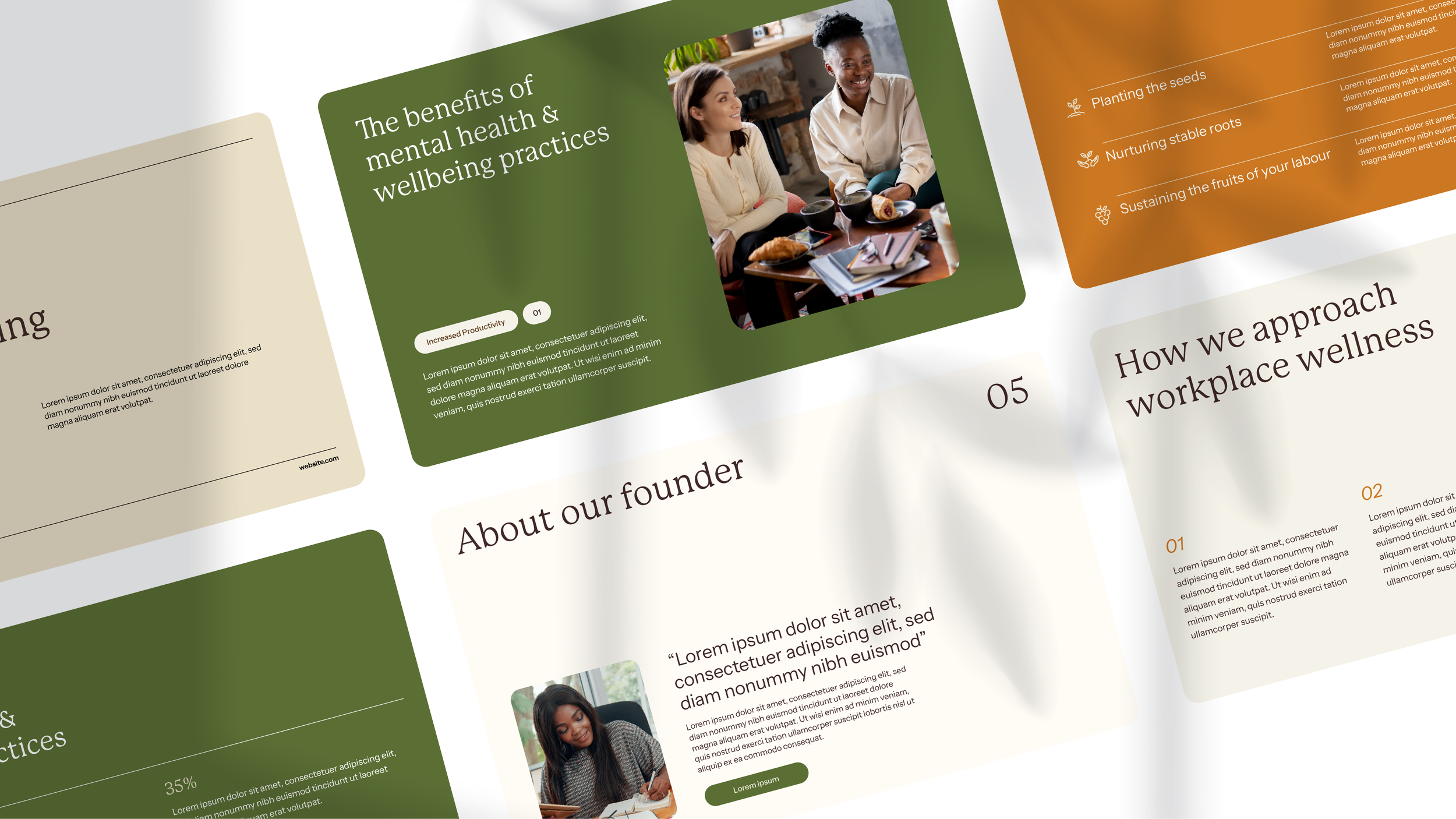
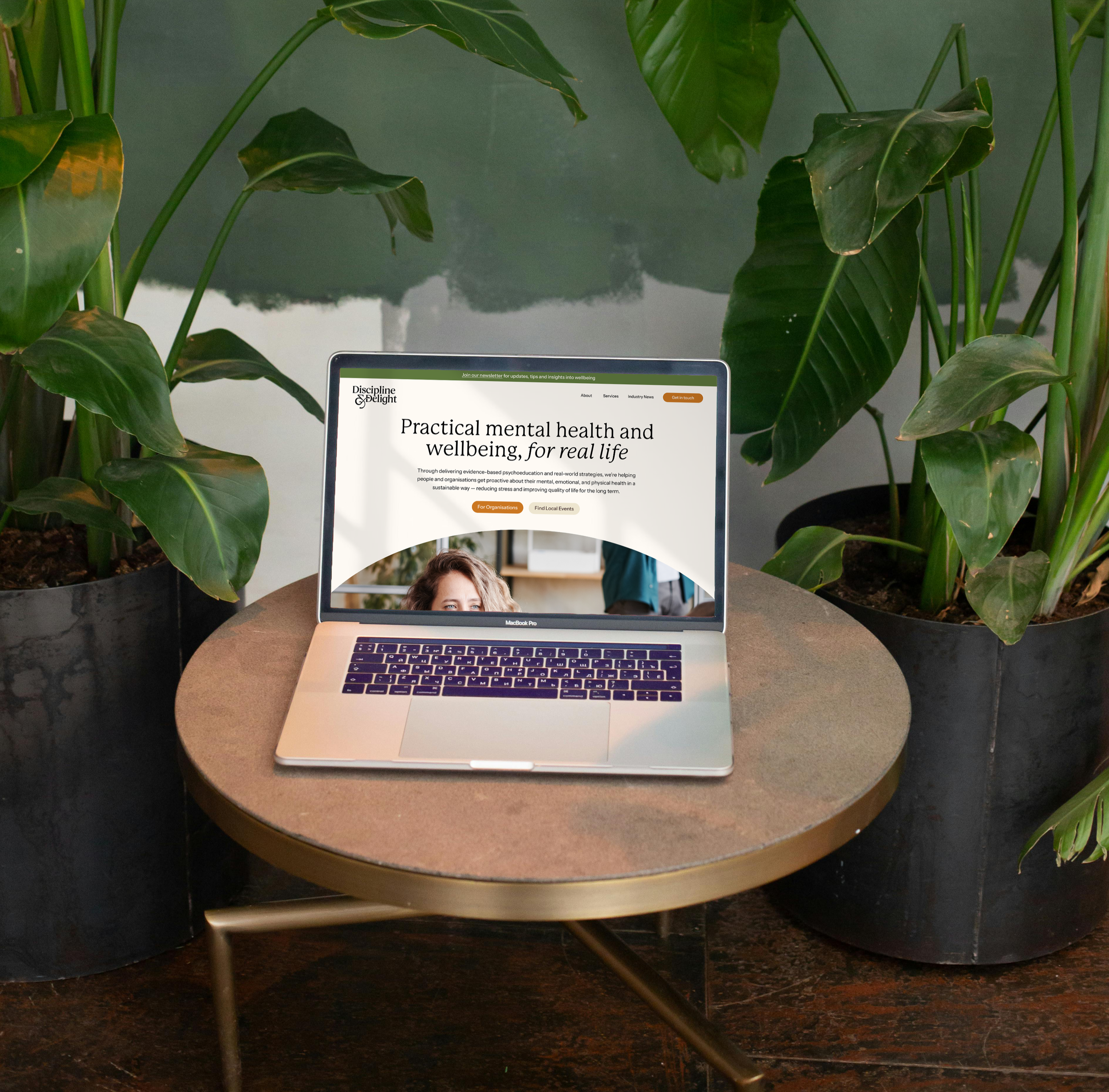
A thoughtful identity designed to grow with the business. Bringing together the founder's inspiration and the strategic direction of the brand, a versatile logo suite was developed, including primary, secondary and icon variations to suit different applications.
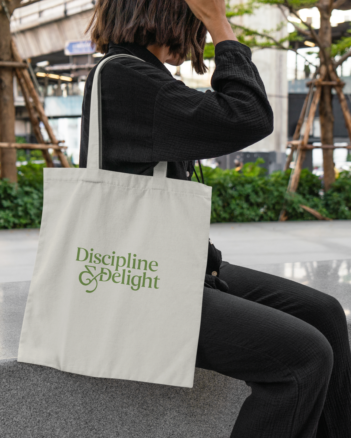
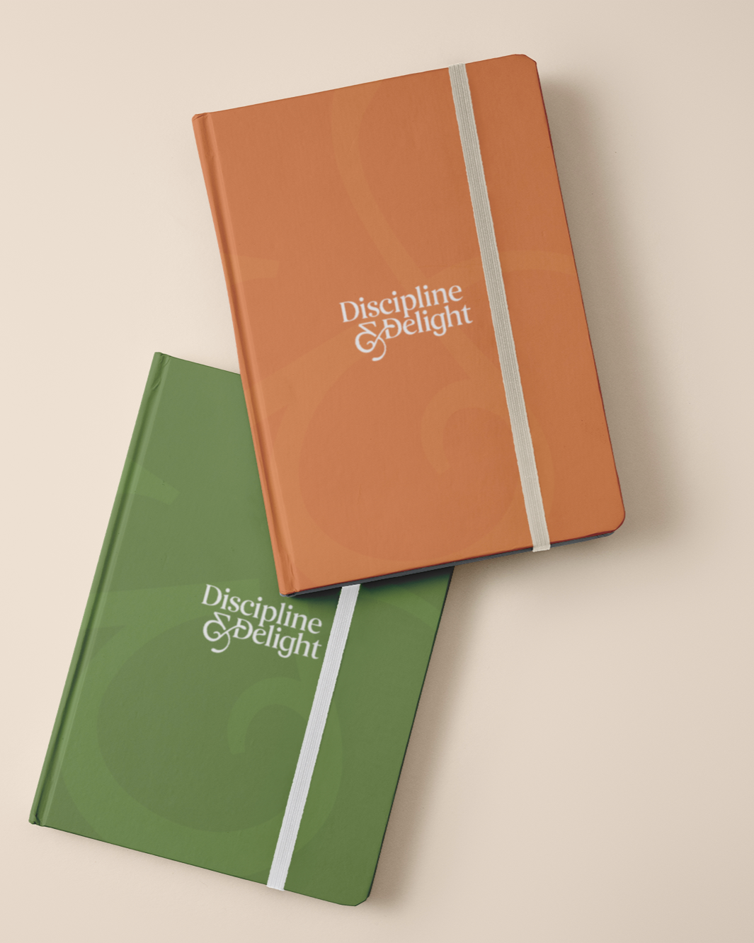
A carefully considered colour palette and typography pairing bring warmth, personality and approachability to the identity, while maintaining the professionalism expected of an accredited expert. The result is a cohesive, human-centred brand that feels equally at home speaking to individuals in the community and businesses, giving the founder the confidence to apply it across different settings.

“I had such a great experience working with Sophie on my logo and brand design. She was incredibly patient, receptive to my feedback, and generous with her professional knowledge and expertise. Communication was excellent throughout, and everything was clearly explained at every stage. As someone new to the world of branding, I initially felt overwhelmed, but Sophie made the whole process feel easy and reassuring. I would highly recommend her to anyone looking for professional, supportive and creative branding expertise.”
DR WILLIAMSIt all starts with an idea.
Discipline & Delight now has a warm, thoughtful identity that reflects the expertise behind the business without feeling clinical or intimidating. Balancing professionalism with approachability, the brand creates a welcoming, credible presence that can connect with individuals and organisations alike, while giving the founder a strong visual foundation to build upon.
Whether you're starting something new or looking to give your existing brand a fresh perspective, I'd love to help bring your ideas to life.